In these days of information overload visual representations offer a useful strategy for helping students see patterns and connections. They also help make information accessible to all learners, including those with EAL or reading challenges.
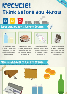
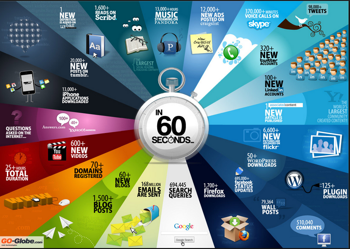
I’d like to explore some links and tools for collecting data (raw and unprocessed) and turning it into something that communicates a meaningful message (information). A trend that has been gathering momentum recently is the idea of presenting information through well-designed infographics combining illustrations, text and charts of one kind or another. Here’s a nice example on photosynthesis from Kids Discover.
These infographics often include data visualisations, which show the relationships between data sets using colours and shapes, maybe as a timeline, diagram, flowchart, map, word cloud, graph, concept web or table. Have a look at this TED talk from David McCandless about how these representations can help us to see patterns and connections and ‘make information beautiful’.
You’ll find some lovely examples of these on David’s website, and a Pinterest search of ‘infographics’ reveals many more. Here’s a selection aimed at children from Reading Rockets. The Daily Infographic has a new, data-filled illustration each day and a good catalogue of past finds. I have my own collection of links for data and infographics on Pinterest too.
In order for children to get the most out of infographics, they will need to learn how to read and navigate them and how to interpret the charts and diagrams. TechChef4u has 8 lesson ideas for developing infographic interpretation skills. Even better, children can deepen their understanding by making their own infographics. Online tools such as piktochart, visual.ly and infogr.am, with pre-defined templates offer a simple way to start.
 The beauty of these tools is the potential for children to combine their own local investigations with data from around the world and compare trends. This can give them a feel for the difference between first hand data (primary data) and data collected by someone else (secondary data). They come with built-in charts for displaying quantitative data, or you can create your own with tools such as Google Chart Editor, Pictograph Creator, or Piecolour. You can make your own pictograms in Excel or add word clouds using Wordle or Tagul. All of these diagrams can then be added to the emerging infographic.
If you’re feeling ambitious you could take the infographics idea a stage further by adding data and information to films using YouTube Annotations Editor or to photostories in Animoto or PhotoPeach. Get inspiration from Little Red Riding Hood reinterpreted as a data story by Tomas Nilsson or this amazing video from General Electric about capturing and converting energy from train brakes.
With infographics creation as a way of sharing findings, children can be encouraged to adopt an inquiry-based approach to data collection and research in collaboration with their peers. It is worth pausing at the beginning of such a project to allow time to come up with a provocative and tantalising question. Watch Ewan McIntosh’s video The Problem Finders and think about how giving students time to define their own problems can help them think more dynamically.
One starting point might be to brainstorm individual topics within an overall theme such as ‘change’. Taking an historical approach, children could explore census data on the National Archives website and compare it with a database they construct about themselves, including making their own family tree. From a geographical point of view they could use History Pin and the historical imagery slider in Google Earth to investigate how places have changed over time: (the Beijing and London Olympic Stadiums, the shrinking Aral Sea and the building of the Palm Jumeirah in Dubai are good examples). Climate change offers another slant, with opportunities to scroll around 26,000 weather stations on Wundermaps, or to look at Metlink, GlobalWarmingKids or resources from Education Scotland. You’ll find some great ideas on TechChef4u for combining webtools, apps and data sources to explore data patterns. Alongside these sources, survey tools such as Google Forms and Survey Monkey can be used to collect local data.
Whether you are reading them or creating them, infographics offer a dramatic way to share data stories. The layering of visuals and text means that they can be interpreted on many levels, making it easier for all learners to make meaning for themselves. See if you can make information beautiful in your classroom!


Pingback: Developing visual literacy through infographics | Helen on ICT | Future Focus Learning in Australian School Libraries | Scoop.it
Pingback: Developing visual literacy through infographics | Helen on ICT | 21st Century Literacy and Learning | Scoop.it
Pingback: Developing visual literacy through infographics | Helen on ICT | Teaching through Libraries | Scoop.it
Pingback: Developing visual literacy through infographics | Helen on ICT | careyque2
Pingback: Developing visual literacy through infographics...
By adhering to the guidelines provided by the U.S. Customs and Border Protection, you can enjoy tax exemptions on certain items and avoid any unnecessary fines or delays. Remember to stay informed about the latest regulations to ensure a smooth customs clearance process. Happy travels and enjoyable duty-free shopping https://www.youtube.com/watch?v=4wX8BRgQnmY
Wow! Thank you! I continuously wanted to write on my website something like that. Can I implement a fragment of your post to my website?
bom89
Awesome article, Thanks a lot.
My website: https://www.bom89.infinityfreeapp.com/
Awesome article, Thanks a lot.
My website: https://128.199.173.177/
Awesome article, Thanks a lot.
My website: https://152.42.179.223/
Awesome article, Thanks a lot.
My website: https://152.42.204.21/
Wow! Thank you! I continuously wanted to write on my website something like that. Can I implement a fragment of your post to my website?
My website: totobet69